


- Erotic Couplings
- Story Card Update on New Stories Page
Note: You can change font size, font face, and turn on dark mode by clicking the "A" icon tab in the Story Info Box.
You can temporarily switch back to a Classic Literotica® experience during our ongoing public Beta testing. Please consider leaving feedback on issues you experience or suggest improvements.
Click here
Happy Holidays everyone reading and writing at Literotica!!
Thank you to everyone who shared constructive feedback about the new design of the New Stories Page. While most Literotica Readers on phones seem to like the updated responsive design, a suggestion that we heard often was that the new Story Cards can be difficult to quickly scan on wide screen desktop browsers and high resolution tablets.
The reason the Story Card was difficult to scan on wide screen devices (according to the feedback we received) is that the Category and Date are right aligned. On narrow screen devices (like phones), the right alignment is easy to scan. As the Story Card gets wider, right alignment separates the Category and Date from the Author Name.
We've attempted to resolve this issue by changing the behavior of the Story Card on wide screen devices only. If you're using a wide screen device to view the New Stories Page today, you should see a change to the alignment of the Category and Date.
This is what the two different versions of the Story Card look like:
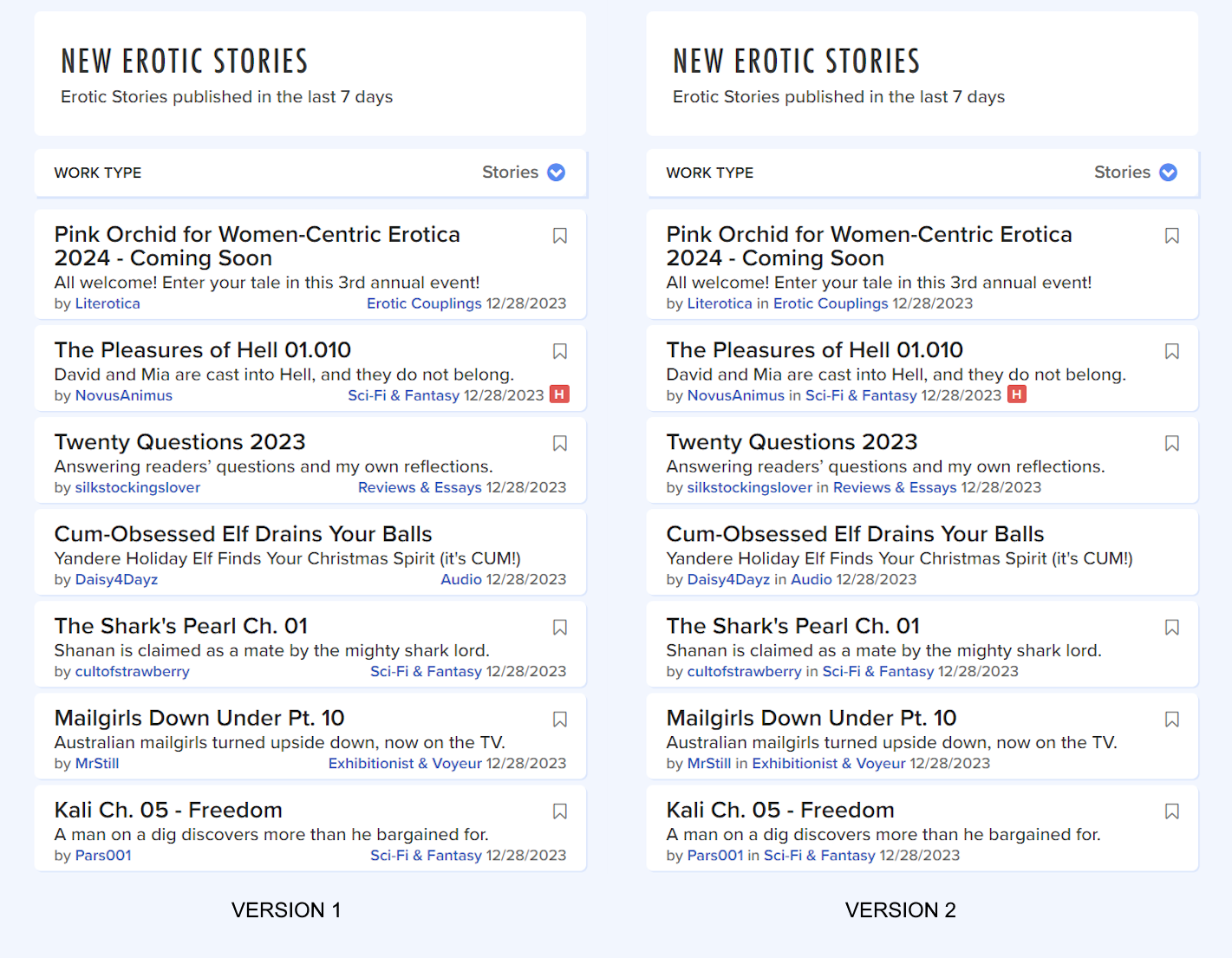
To see the new Story Card behavior (Version 2), you must be viewing the New Story Page.
Compare the New Stories Page behavior to the current version of the Story Card (Version 1) on the Tags Portal (Romance).
If you're using a phone or other narrow screen device, you shouldn't notice any difference between Version 1 and Version 2.
Please take a look at both Story Card designs and let us know in the comments which one you prefer and if you have any suggestions to improve the behavior.
Thank you again for all of the helpful feedback and have a Happy New Year!!
- COMMENTS
using my lap top I would prefer version 1 but I get version 2. I have found that I look less as I am on less since it is to hard to read. I log on here for enjoyment and to relax, now I have to work to find what I am interested in
I only use a phone, so I’m not seeing any difference.
One thing I would like to see is the addition of filters to the page, if possible. It would be nice to be able to see only specified categories.
I suddenly can't filter stories by category. It takes three times longer to look through all the text to find category and skip if I'm not interested.
Otherwise, it would be good to have rating also on the New page.
V1 looks way way better, it's less crowded which means more legible & more dyslexia/learning disability/ADHD friendly. Hope there's a better way to resolve the issue than this :/
The last line is overloaded so not all of the information is visible. A long category truncates the author. An icon hides the date.
Possibly just append all the items and wrap the line. I think easily seeing all of the data is more important than trying to make it look pretty.
Version 1 better missing arthors in like storys list after reading something .. It was good quit trying To Improve It ..Fix It Until Its Broken ... I Would Like To See A GAMES Catagory/ Tag Spin The Bottle, Strip Poker Etc.. Some Games Have Suggestion Cards Could Be A Tie In To Store Sell Sets To Print Out
,New Ideas Get Free Ones ? ..
Prefer Version 1. I access the site on both a wide screen desktop and an Android tablet. I prefer to search by category and it is much better to find stories when the category is on the right hand side of the pane. Having it as set out in Version 2 it much harder to navigate.
Version 2 is far preferable. I also liked the suggestion to add the rating following the date, instead of the h for hot.